Overview
This case study dives into the redesign of a high-traffic online campaign for BankGiroLoterij Millionaires, a prominent Dutch lottery television game. Our goal was to significantly increase user engagement and conversion rates while upholding the brand’s playful and exciting identity.
How it works
It’s a campaign starting with an online leads game just like the TV show. You answer 3 questions, and if you get them right, you have the change to win €1,000,- . Followed by the main online campaign where you can win money instantly. You can win up to €16,000 on the spot, with at least €20 guaranteed as a prize. All you have to do is joining the BankGiro Lottery.
1.
25% increase in conversions
2.
15% reduction in form abandonment
3.
10% improvement in user satisfaction because of the Millionaires lead game.
1.
The last Millionaires campaign design was cluttered and confusing, leading to low user engagement and conversion rates.
1.
Gamification in the journey: just like the actual Television show we made the online journey more fun and engaging.
2.
Simplified User Journey: We streamlined the process, eliminating unnecessary steps and reducing cognitive load.
3.
Enhanced Visual Hierarchy: We prioritized crucial information and employed clear, concise language.
4.
Optimized Mobile Experience: We prioritized mobile-first design, ensuring a seamless experience across all devices.
1.
This project reinforced the power of user-centered design and the value of A/B testing. By iteratively refining our designs and gathering user feedback, we achieved substantial improvements in user experience and conversion rates.
With every campaign I did A/B testing and it’s a continual proces to sharpen the conversion. I was part of the CRO team and for upcoming campaigns we planned and designed A/B tests. These are some examples I can give you:
Feedback on code
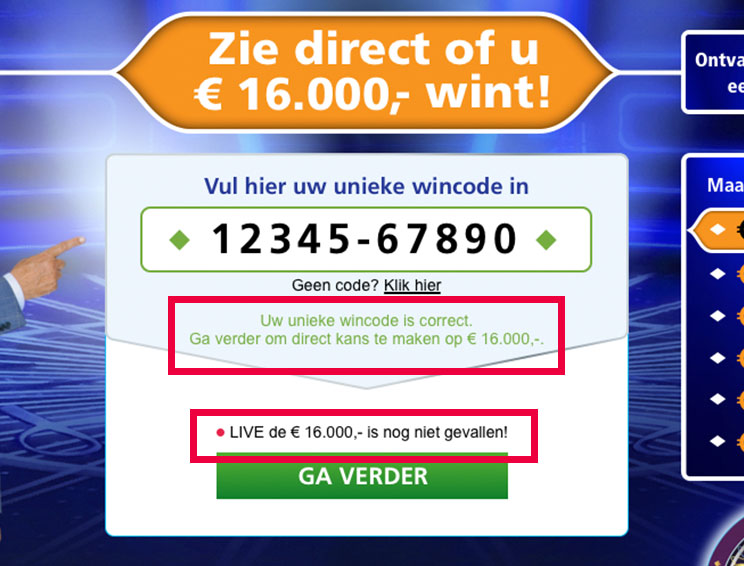
You get feedback when entering the winning code.
Blinking 'eye on the price"
The blinking red dot indicates the price of €16.000,- is still available

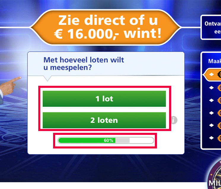
Ticket test
This was a test to see if people are willing to buy 2 lottery tickets at the same time.
Progres bar
From former tests we knew an indicator helps to increase conversion.

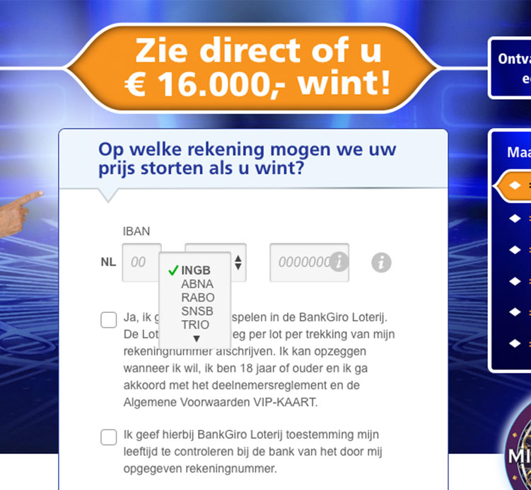
Iban Dropdown
This IBAN selection dropdown converted better then a normal input field.

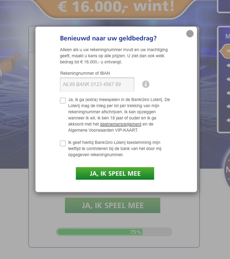
Iban Overlay
Based on data insights revealing users skipping the IBAN field, we conducted an A/B test with a layover to encourage completion. The test results were not statistically significant, suggesting alternative solutions may be necessary.

To fuel the excitement for our main campaign, we launched the Millionaires Lead Game. This free-to-play experience allowed us to collect email addresses, ensuring we could keep potential customers informed about exclusive offers and timely updates.

This campaign had several sales flows on desktop and mobile with a great deal of deliverables and emails. Some A/B test has been done with good insights. You see them below.
If you are wondering why Robert Ten Brink is pointing his finger….Its because this converts better.

