Overview
Testing is an ongoing process, and I have conducted numerous experiments to discover which approach is the most user-friendly. One of the techniques we employ is ‘chunking’: breaking down one long form into multiple, manageable steps (for example, a two-step or three-step process). This technique is based on insights from cognitive psychology. Our brains can process information more effectively when it is divided into smaller, logical segments, thus reducing cognitive load. Furthermore, this helps address various biases that can occur when users are confronted with a large amount of information all at once. The examples I share here are merely a small selection of the many tests I have conducted over time.
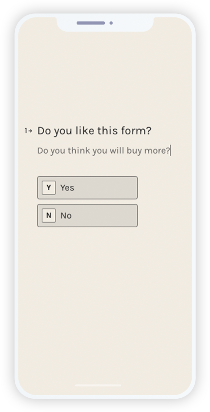
When Typeform gained popularity, we tested it in our campaigns. We compared it to the traditional 2-step form( you can see this below) and found that Typeform converted 14% better—a highly significant improvement!
Avoid overcomplicating your testing process. Multivariate and A/B/C tests require significantly larger sample sizes, making them less efficient and harder to interpret. A/B tests, on the other hand, are faster, simpler, and more effective for most e-commerce brands.
For this test :
- Same header image (eye on the price!) for the whole flow.
- Start with asking for the first name – a mix of informal and formal questioning.
- Step Indicator – Clearly show the user which step they are on
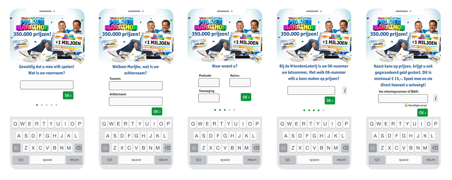
This visualization shows a clear drop-off at each step. Out of 6,353 users who start, only 11.6% complete the flow. A significant drop occurs right after entering the first name, with 65.24% abandoning at the last name step.
Sensitive fields like the bank account number create additional friction, and in the final step (extra info), nearly 48% drop off. While this Typeform approach performs better than a traditional 2-step flow, there is still room for optimization, such as reducing early-stage friction and better guiding users through the process.
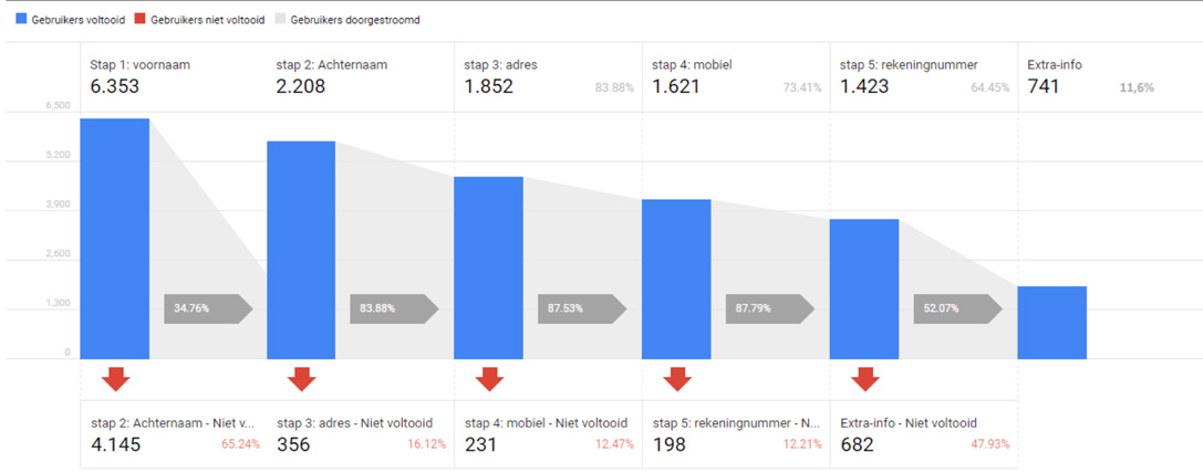
This example was an A/B/C test. Showing you below the B variant.
- A. The regular 2 step flow.
- B. Typeform with IBAN at the end.
- C. Typeform with IBAN after step 2.
For this test :
- Eye on the price only first page. More focus on the question as if Chantal is asking you the question.
- Chantal is looking at you and not to the form.
- personification used in the flow.
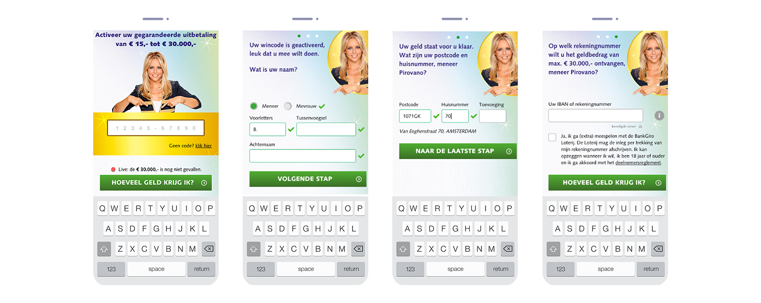
This is an example of a baseline flow for testing mobile conversions. I’ve conducted many tests, but this highlights the need for a structured approach to testing and iteration. Every test you run has the potential to significantly improve your business results.
Again this is a typeform flow, below i give you an example of the ‘baseline’ this is tested with.

One major takeaway from this analysis is that users should never have to scroll when a field is activated. Any unnecessary movement disrupts the flow, increases cognitive load, and adds friction, which can lead to higher drop-off rates. Keeping fields within immediate view ensures a smoother, more intuitive experience, ultimately improving completion rates.
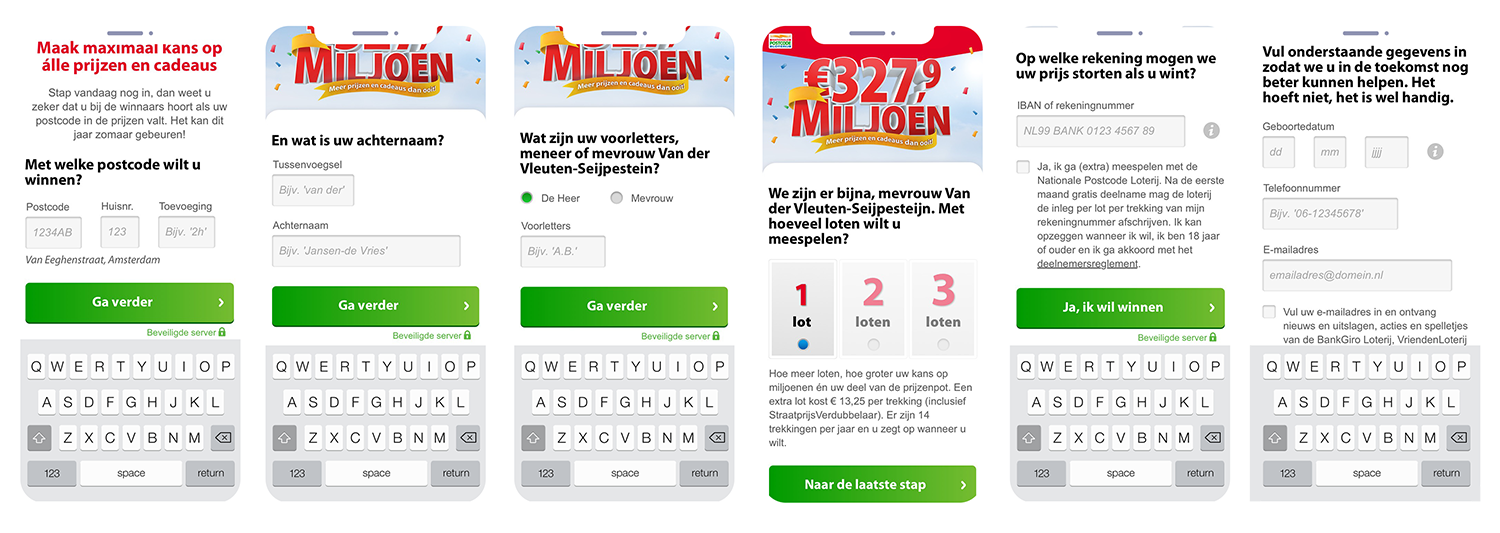
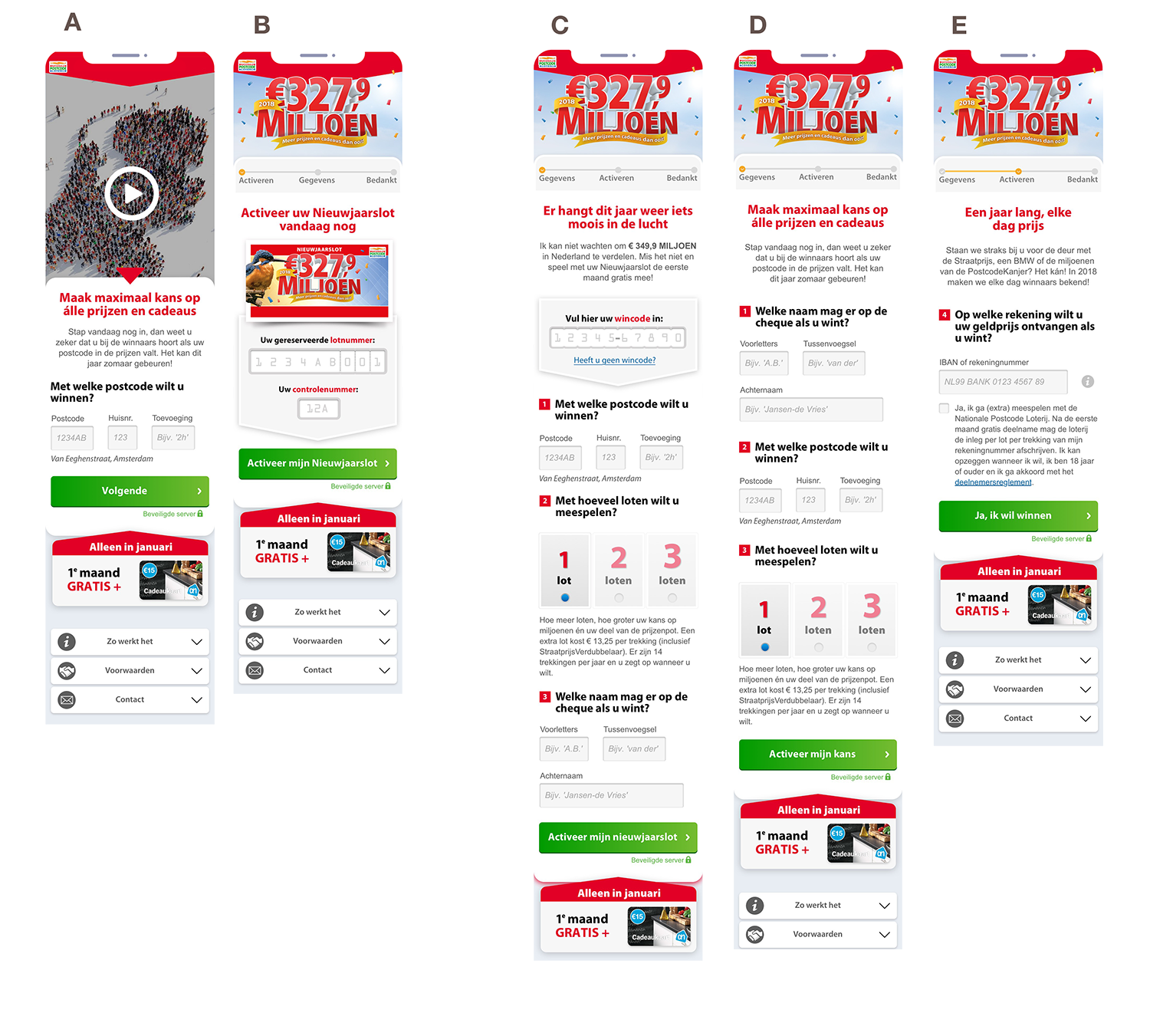
This is a baseline flow for testing mobile conversions:
- A: Video landing page test
- B: ‘Eye on the price’ Landing page + code entry
- C: 2-step form with code entry landing page
- D: 2-step form landing without code entry
- E: Step 2 with the IBAN entry
This structure serves as a starting point for optimization, allowing us to test the impact of video engagement, code entry, and form structure on conversion rates.
