Project overview
What is the 'CUSTOM CHART' feature?
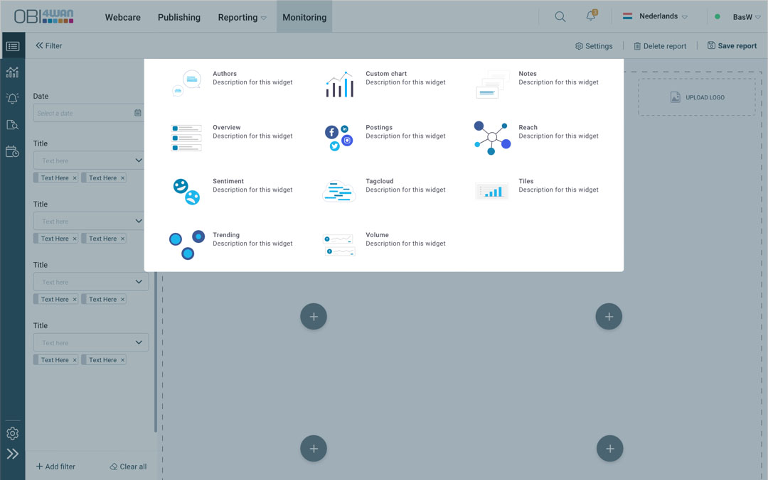
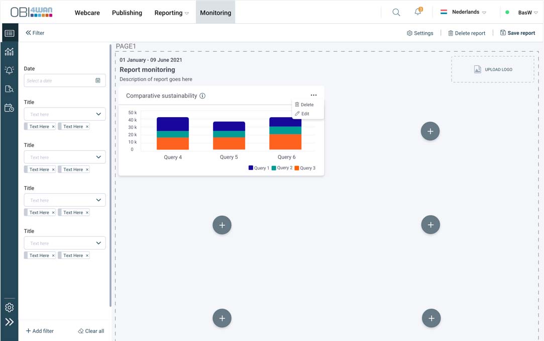
This function is a query to query chart and mostly used by media analist’s. Basically you combine different searches to get to your information.
It’s a new developed version of the older ‘Brands & Topics’ feature from the older Brand Monitor product.
My role & responsibilities
As the Senior UX Designer on this project, I led the research and product development processes. I collaborated closely with the Product Manager, a junior UX designer, and the development team to ensure a cohesive and user-centric approach.
Project overview
Problem Statement
The older Chart “Brands & Topics” brought confusion to the users. A chart to combine ‘searches’ was urgent for the ‘heavy’ users like Analists to work with. This needed a redesign with the feedback of these users.
The Goal
The old version the feature was limited and outdated. What the user needed was all the freedom to schedule an email to their stakeholders.
RESEARCH
From the interviews with our Brand Monitor users we knew this function was very important to them. From their feedback we could make this function as simple as possible.
CHALLENGES
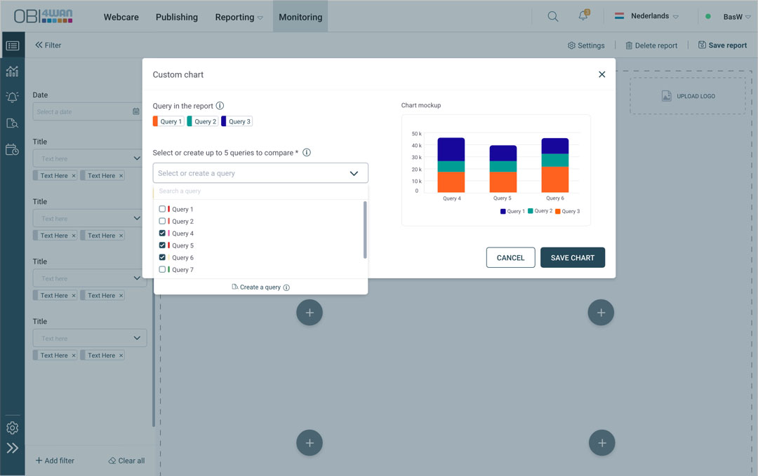
The stakeholders wanted to keep ‘Brand & Topics” as the functional title. They thought it was still a good ‘branding’ title for this function. Most users didn’t even know what this function was about. ‘Custom Chart’ was more clear. The ‘Chart Mockup’ also was helpful to the users to understand this feature better.
DESIGN
It took several prototyping sessions with users to get to this design. After the product release to a group of customers we could also collect insights to sharpen its UX.
Details
- Duration: 7 weeks
- Tools: Sketching, Mural, Adobe XD.
How can we help the users to quickly understand this function better?
Design Challenge
Design Proces
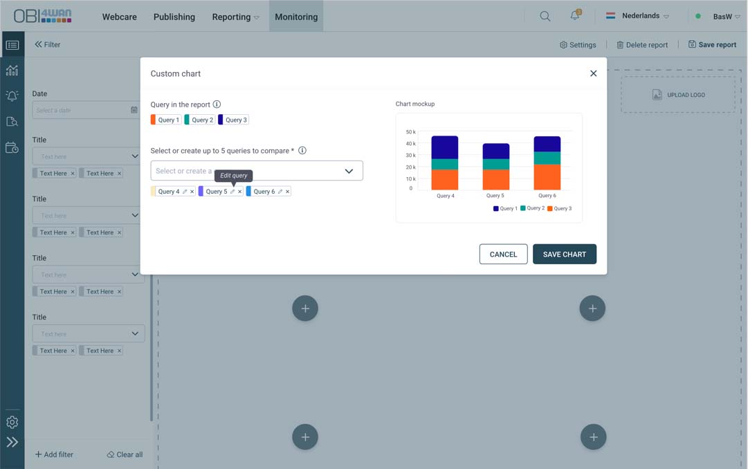
By showing the ‘CHART MOCKUP” when users are selecting their queries it helped them to understand & process this function better. Also by stripping down this feature to its real function.. its just comparing queries to queries .. that’s it .. it suddenly made more sense to the users and wanting to play around with it.
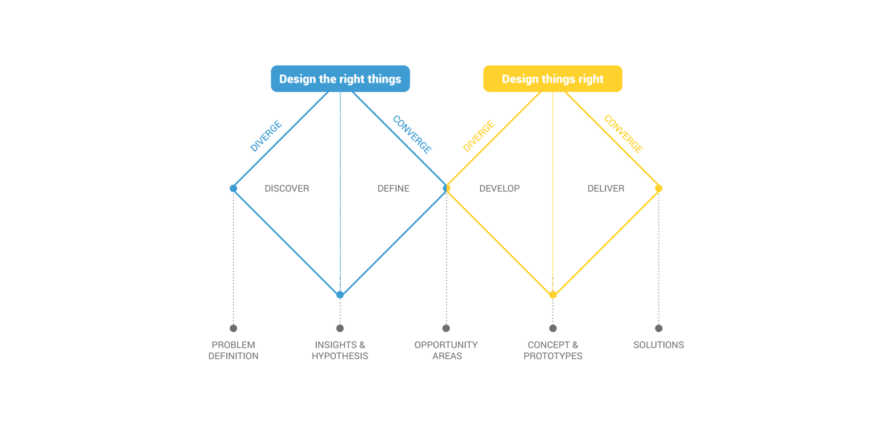
The human centred design process starts with a good understanding of people and the needs that the design is intended to meet. We were using the Double Diamond process, originally released by the British Design Council. I like this framework for its structure, clarity and dynamics. The two diamonds represent a process of exploring an issue more widely or deeply (convergent thinking) and then taking focused action (convergent thinking).
Empathizing with users
User Interviews
This is one feature of many for this large scale project for the new Media Monitoring Product. We organized a group of users to do interviews with and did this for the whole product but also divided this in sections for the many features involved. We got some feedback from users and customers from the account managers this helped to dive in further to identify challenges users encountered, and noted the obstacles they faced. Subsequently we collected valuable feedback that enabled us to categorize and prioritize the identified user problems.
User research: pain points
I don’t know what this ‘Brand & Topics’ means. I tried it sometimes but I don’t get anything out of it.
Basically I just want to get any information I want. Don’t give me limits. Anything with anything is the right vision.
